
 Yahoo Sports
Photos/video: Redblacks unveil new Reebok “Signature Look” plaid lumberjack uniforms, becoming the official team of #hoserism

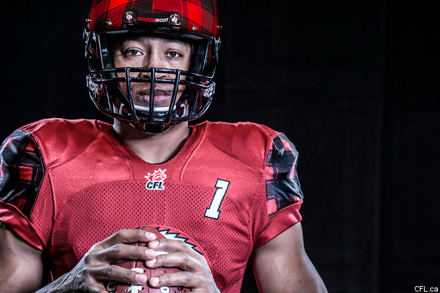
The CFL's renowned for being a league full of Canadiana (or #hoserism), but the expansion Ottawa Redblacks have taken that to a whole new level this year. Their bilingualism, buzzsaw logo, embrace of Canadian franchise legends like Russ Jackson and Tony Gabriel, usage of local history/folklore-inspired mascot Big Joe/Grand Jos and chainsaw-revving touchdown celebrations have all been impressive. However, the team one-upped themselves Monday with the release of their new "Signature Look" third jersey (which quarterback Henry Burris is seen displaying above). The jerseys will be worn for the first time August 24 against the Calgary Stampeders, which is perfect, as they're the other red and black team in the CFL. Here's a video unveiling of the new jersey:
That's right: they've gone to plaid!
All of the jerseys unveiled so far have been impressive and unique, from B.C.'s sleek gunmetal grey to Saskatchewan's incredible array of 50 (or so) shades of green to Toronto's giant logo, tiny numbers and teal pants. However, Ottawa's might be the most perfect yet; these are so different from anything that's ever been done in this league, but so perfectly correlated with the history of the area and the past of the CFL in Ottawa. (It's notable that the original "Rough Riders" name was based on lumberjacksas well as Teddy Roosevelt and his troops, so this fits right in with the franchise's history.) If you looked up "Canadian lumberjack" in the encyclopedia and made a few modifications, you'd wind up with something like this. It's like Michael Palin suddenly changed his mind and never wanted to be a lumberjack, but a football player!
Given how different this is from most uniforms, it's not surprising quarterback Henry Burris was so stunned by the jersey:
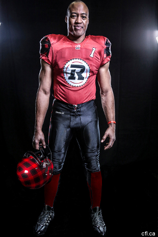
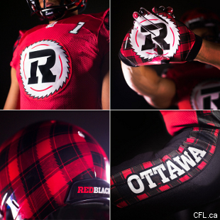
This works with the team's overall theming and ties to history, too. As Redblacks' VP of partnership and merchandise sales Adrian Sciarra said in the jersey unveiling video, "We have a black home jersey, we have a white away jersey. We wanted to put the red in Redblacks and have a red third jersey. Beyond that, we wanted to create that link between Redblacks and the history of Ottawa as a logging town, the sawblade logo, the plaid and kind of work all that into a uniform, not just a jersey, but a uniform that accentuated some of that logo and history."
The red-and-black plaid isn't overdone, either. Having it on the helmet, the shoulders, the sides of the pants and the gloves is perfect, leaving room for the rest of the jersey to be a more standard red and black. The jersey also puts the sawblade logo front and centre, differentiating it substantially from the team's usual home and road looks. This league's always been renowned for its Canadian content, but the Redblacks have gone above and beyond here. Plaid aficionados everywhere, this is your jersey. Keep calm and log on, eh!
