
 Yahoo Sports
CFL’s new West Division jerseys unveiled: how do they stack up?

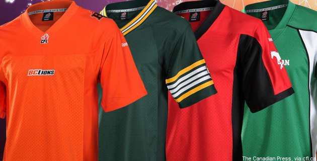
The week of paradise for CFL uniform junkies continues, as following the East Division teams' new jersey releases Monday, the four West Division teams announced their own new looks Tuesday. Here's a breakdown of the B.C. Lions, Calgary Stampeders, Edmonton Eskimos and Saskatchewan Roughriders' new looks, complete with photos, an overview of what's new, hits and misses and rankings.
Saskatchewan Roughriders:
New jerseys:

Old jerseys:
What's new: The jerseys' second colour (white on the home ones, green on the road ones) is now its own panel under the arms and down the sides. The black shoulder stripes have been removed. The stripe on the pants is now tapered rather than single-width. (See this for a side view of the old ones, and this for a look at the old road uniforms.)
Local take: "New Riders jerseys look pretty good..a lot better than some of the Eastern duds unveiled yesterday." — Warren Woods, Global TV.
Hits: I love the side-panel decision. It's more of a soccer-jersey style than something we've traditionally seen on a lot of football uniforms, so it's a bit of a bold move for the Roughriders (and it certainly will have its detractors), but in my mind, it looks terrific and really stands out from many of the rest of the CFL uniforms. It's also a way to prominently include the second colour without putting too many elements on the main torso.
Misses: It's a relatively minor quibble, but I think the road whites would look better with white socks. The green shirt-white pants-green socks combination looks tremendous on the home uniforms, but the green pants and green socks blend into each other too much.
55-Yard Line rating: 4.5 stars (out of 5).
Calgary Stampeders:
New jerseys:

Old jerseys:

What's new: Much like the Roughriders, the Stampeders have embraced differently-coloured side panels, but only for their home jersey, where the sides are now black instead of red. As you can see from further shots on the team page, they're also going with black pants with the red jerseys now, and those pants are just straight black with no stripes (much like the ones they used to use with the primarily-white jerseys). The red on the road jerseys now extends all the way across the top instead of just around the neck, and the black shoulder stripes have been replaced by black at the end of the sleeves. The road jerseys also now have white pants.
Local take: "Oh dear, #stamps. This namebar is illegible. Also, I thought you learned your lesson with those terrible black helmets." — Graham Bakay.
Hits: I applaud the decision to go to the black side panels and black pants on the home jerseys. There's much more contrast than there used to be on the old mostly-red jerseys. Some will say there's not enough white, but the numbers are still white, as are the socks; that's enough to respect the history while still doing something more interesting with the main jersey. The wider red bar on the road jerseys is nice too.
Misses: The road jerseys don't really look all that interesting from here, especially with white pants. They're essentially straight white from the shoulders down. Black or red side panels would have helped considerably.
55-Yard Line rating: 4 stars (out of 5).
Edmonton Eskimos:
New jerseys:

Old jerseys:

What's new: The basic look of the mostly-green home jerseys (see the old ones here) is the same, but the shoulder stripes have changed from a gold and a white stripe to two gold stripes around three white stripes. The road jerseys have changed substantially, though, and there's a lot more green on them, particularly on the shoulder/side/back panels. They've also had the same shoulder stripe change, and their lettering is now gold instead of green, plus the lettering is now on a green background (compare this old shot of Greg Peach to the new jerseys). They'll be wearing green helmets with these instead of gold.
Local take: "Have to say, I like the Eskimos new jerseys. It'll be different to see them sporting the green helmets with the whites." — Evan Daum, Edmonton Journal.
Hits: I'm a big fan of what the Eskimos have done with their white road jerseys. The old ones were exceptionally boring, while the use of the green shoulder/side/back panels on the new ones really makes them stand out. The new shoulder stripes on both sets are solid, too.
Misses: From this corner, there was an opportunity to do more with the green and gold home jerseys. These really aren't all that different from what we've seen recently. More gold or white on the shoulders or sides could have helped.
55-Yard Line rating: 4 stars (out of 5).
B.C. Lions:
New jerseys:

Old jerseys:

What's new: Not a vast amount. The black piping around the shoulders is gone on both the orange home jerseys and the white road ones (you can see the old road ones here). Everything else looks pretty similar from here. The big change is just to the new material.
Local take: "Is it just me but do the new BC Lions jerseys look exactly like the old jerseys?" — Jim Morris
Hits: The orange and white obviously has plenty of local support, so the team isn't messing with what's working.
Misses: This is really down to personal preference, but the Lions always looked best to me in the black jerseys, so I can't say I'm really a fan of dropping black almost entirely off the uniforms (it's only there as pant stripes now). Also, it would have been nice to see them make a few bolder changes the way some of the other teams did.
55-Yard Line rating: 3 stars (out of 5).
