
 Yahoo Sports
East Division new jerseys unveiled, with some hits and some misses


If you're a CFL uniform junkie, this is your week. All eight teams are rolling out new jerseys this season, and they're unveiling them Monday and Tuesday. It's started with the new Winnipeg Blue Bombers, Montreal Alouettes and Hamilton Tiger-Cats' jerseys, which you can see above (left to right), and continued with the Toronto Argonauts launching theirs Monday night and the West Division teams following Tuesday. In addition to new looks, the uniforms also feature some technical changes, which you can read about here. The jerseys are already stirring up plenty of discussion, so we thought we'd add to the conversation. For each of the East Division teams, here are images of the old and the new, an overview of what's new, local takes, hits and misses and a 55-Yard Line rating. (Note: this post has been updated to include the Argonauts' jerseys; if you're eager to read the section on them, click here!)
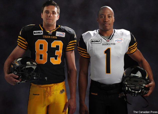
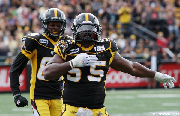
Hamilton Tiger-Cats:
New jerseys:
Old jersey:
What's new: As outlined here, changes include extra stripes on the sleeves, the removal of the helmet stripe and gold numbering instead of white on the home jerseys. It looks like the gold colour may have changed a bit as well, to more orange and less yellow, but that could just be from the lighting.
Local take: "Cat-o-philes will be poring over the Tiger-Cats' new outfits, from head to ankle, with a critical eye today. And they should like what they find." — Steve Milton, Hamilton Spectator.
Hits: I love what they've done with the home jersey here; the gold numbers are a particularly neat touch, and the jersey as a whole looks a lot more distinctive with only the black and gold. Putting the stripes on the sleeves and legs and removing the helmet stripe (which leads to what Milton calls a "very Darth Vader" pure black helmet) is also a solid move.
Misses: The away uniform doesn't really stand out in my mind. The black pants with gold stripes are nice, but the mostly-white jersey looks too plain from here, and it's not that different from the old one (which you can see here).
55-Yard Line rating: 4.5 stars (out of five).
Winnipeg Blue Bombers:
New jersey:

Old jersey:
What's new: The biggest change is going to primarily-gold road jerseys instead of primarily-white ones. Both sets of jerseys also feature the classic block "W" logo, though, and the home jersey has seen substantial change to the sleeves, which are now gold with a white stripe instead of blue with a gold stripe.
Local take: "If I was an Arena Football fan or a member of the mid-1990's St. Louis Rams, I'd think they were cutting edge." — Chad Wassing.
Hits: I like the idea of going to gold for the road jerseys. There are too many white jerseys in this league, and the gold's very distinctive. The new gold sleeves on the home jerseys are also distinctive, and the new logo looks solid.
Misses: The home jersey really isn't altered all that much (you can see last year's here), and it could have been. Sticking with the navy and gold scheme is fine, but the jerseys should look at least a little different if they want fans to shell out for a new one.
55-Yard Line rating: 3.5 stars (out of 5)
Montreal Alouettes:
New (and old) jerseys:

What's new: The most noticeable change is the big "Alouettes" across the middle, but the side stripes also seem a little skinnier. Other than that, it's mostly subtle tweaks.
Local take: "I'm sorry, but the Alouettes went from having a nice uniform to this. I think there's too much on the home jersey." — Moe Khan, TSN Radio 990.
Hits: If the stripe is in fact skinnier, that's a nice touch; the old one seemed a bit overwhelming, and this looks better from the photos on the Alouettes' site. It could just be the angle, though.
Misses: I'm not opposed to having the team name in that spot, but the lettering seems too big and blocky; the Tiger-Cats' execution of a similar idea is much better in my mind. Still, the Alouettes kept a lot of what was solid about their old jersey, and it's tough to quibble too much with that.
55-Yard Line rating: 3 stars (out of five).
Toronto Argonauts:
New jerseys:
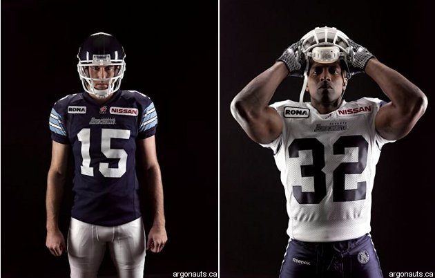
Old jersey:
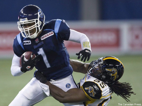
What's new: The home jerseys have seen the lighter blue shift from shoulder stripes to full sleeves, and there are now white stripes on the sleeves. The road jerseys (compare with old version here) now have dark blue sleeves with light blue stripes and also have the shoulder stripes removed.
Local take: "The jerseys are pretty. Simple but classic. Good job from the #cfl to make this happen and well done, #Argos." — Andrew Reeves.
Hits: I love the decision to axe the shoulder stripes and use the other colours on the sleeves. The solid single-colour torso looks much more classic as a result, but the jerseys still have all of the Argos' historically important elements.
Misses: As mentioned with some of these other ones, there's way too much white in the CFL. Still, for a mostly-white jersey, the Argos' road one is still quite attractive.
55-Yard Line ranking: 4.5 stars (out of five).