
 Yahoo Sports
 Can You Spot the Differences in Porsche's Updated Crest?
Porsche has spent the last three years designing a new crest for the company's 75th anniversary. Can you spot the differences?
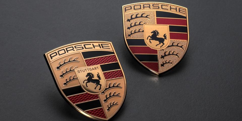
The German sports car maker's logo has remained largely the same since it premiered all the way back in 1952. Designed by Porsche senior designer Franz Xaver Reimspiess, most of the inspiration comes from the place where the company was born. The horse in the middle is taken from Stuttgart's city seal, while he black and red stripes and the rows of antlers reflect the crest of Württemberg-Hohenzollern, the region of Germany where Stuttgart resides.
On first glance it seems as if nothing's changed, but look closer, and you'll begin to spot the differences. The tiny dimples under the "PORSCHE" top lettering, red stripes, and antlers has been removed for a smooth background finish, save for the red stripes which get a new honeycomb pattern design. The rearing horse also gets a bit more detail, along with the word "STUTTGART" in black contrast lettering.
“The ‘75 years of Porsche sports cars’ anniversary was the occasion for us to rework this trademark,” says vice president of Style Michael Mauer. “With its cleaner and more state-of-the-art execution, the refined crest communicates the character of Porsche. We have reinterpreted historical characteristics and combined them with innovative design elements such as a honeycomb structure and brushed metal. The result is an aesthetically ambitious arc that bridges the history and the future of the brand.”
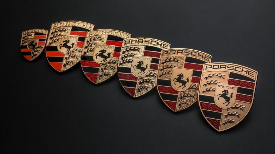
This new crest marks the sixth time the Porsche logo has been updated. It's been previously changed in 2008, 1994, 1973, 1963, and 1954.
You Might Also Like