
 Yahoo Sports
Seattle chooses 'Kraken' for NHL team nickname

The NHL’s 32nd franchise finally has its identity.
After months of speculation, silence, an unfortunate delay and a nautical-themed teaser video, the Seattle Kraken made its team name, logo, and colours official Thursday morning in an announcement led by the CEO of the franchise, Tod Leiweke.
The NHL's newest team is the Seattle Kraken.
Grade the logo and look. pic.twitter.com/weMqI0owvV— CBS Sports (@CBSSports) July 23, 2020
Here’s how the Kraken unveiled their look:
A legend from the deep awakens.
Meet the Seattle Kraken → https://t.co/to5BtVVPh1 pic.twitter.com/FQfOdaiGQQ— Seattle Kraken (@NHLSeattle_) July 23, 2020
It’s worth checking out the Kraken’s official website, because they have laid out their thought process behind the name, colours and other details quite well, but we’ll share a few key points here:
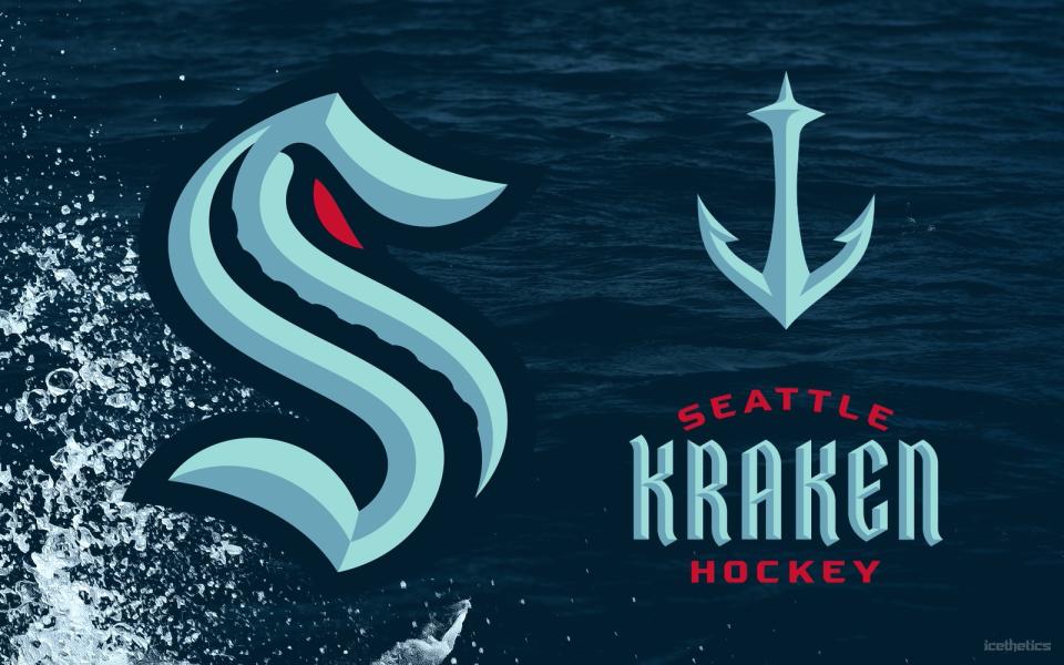
The Kraken represents “the fiercest beast in the world” and “instills one message in all opponents ... abandon all hope.”
The primary S-shaped logo was chosen chose to honour the Seattle Metropolitans, who were the first American team to win the Stanley Cup and are an “eternal part” of the city’s history.
The logo features a single tentacle through the “S” to symbolize “the deep, dark waters of Puget Sound,” while recognizing the The Giant Pacific Octopus, the largest in the world, and which lives in the region’s waters.
Seattle’s secondary logo is an anchor which is shaped at the top like the city’s iconic Space Needle.
The club also provided a sneak peak at its home jersey, but this complete mock-up is making the rounds on Twitter:
Seattle Kraken. Love the Space Needle anchor. Jerseys via @icethetics. pic.twitter.com/TT84styfkd
— Frank Seravalli (@frank_seravalli) July 23, 2020
More NHL coverage on Yahoo Sports

