Pass or Fail: Vegas Golden Knights primary and secondary logos
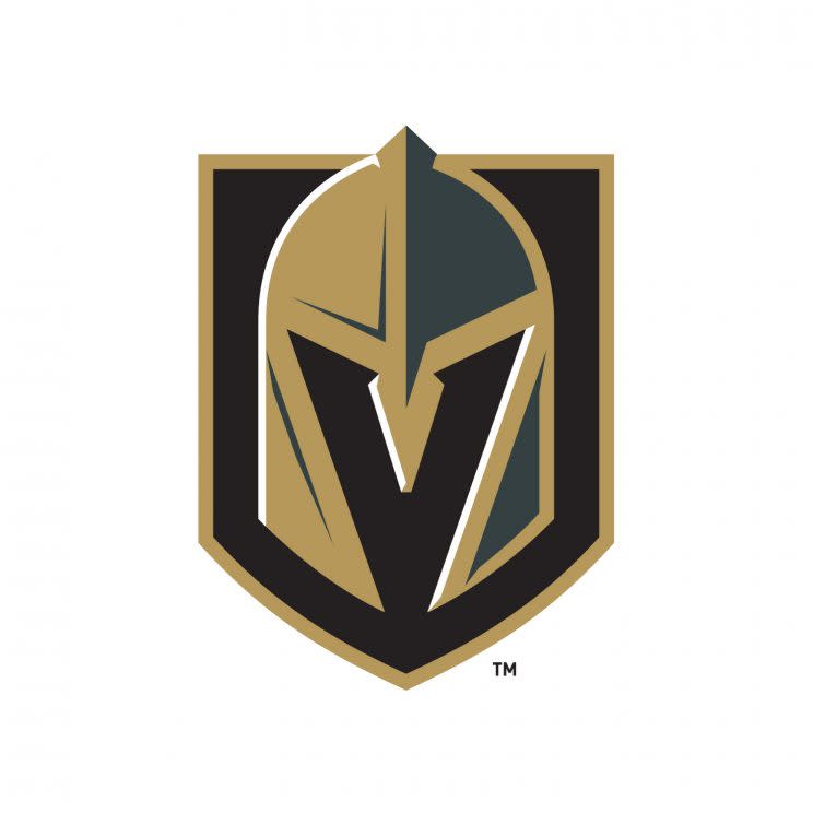
In their logos and colors, the Vegas Golden Knights NHL expansion team tried to incorporate a local flavor along with the personality of owner Bill Foley.
“We want our team to be known for dedication, honor, strength, courage and a commitment to never give up – both on the ice and off,” Foley said in a release that announced the team name, logos and colors. “We want our team to be committed to teamwork, service to this great city and integrity in all things – and we wanted a name and logo that represented all of this and was unique to Las Vegas and our community. Vegas Golden Knights is that name.”
Added Foley, “We selected ‘Knights’ because knights are the defenders of the realm and protect those who cannot defend themselves. They are the elite warrior class.”
Foley is a West Point graduate, and had been partial to some sort of variety of “Knight” in the team name in honor of the Army Black Knights.
[Join a Yahoo Daily Fantasy Hockey contest now]
The Vegas Golden Knights will start play in 2017-18 and will be the first team from a major pro sports league to play in Las Vegas. The organization unveiled a primary and secondary logo along with the team name in Las Vegas on Tuesday.
In the release, the team described the logo and the colors and why they made sense for the new organization.
The team’s colors – steel grey, gold, red and black – reflect the community and the focus of the team:
Drawing on themes associated with knights, the helmet in the team’s logo includes a ‘V’ to represent Las Vegas. The secondary logos include swords that create the star from the iconic “Welcome to Las Vegas” sign.
Here is an image of the secondary logo from the Golden Knights’ website.
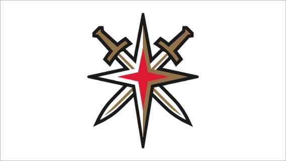
Check out a side-by-side example of how the secondary logo was inspired by the “Welcome to Las Vegas” sign.
For the people who do not understand why the secondary logo is incredible. Look… pic.twitter.com/s40GF8KAWo
— SinBin.vegas (@SinBinVegas) November 23, 2016
Added Foley, “The Vegas Golden Knights team name and logo embody this great city and the mission of our team. When people see it, we want them to say ‘These guys never give up. These guys are going to win.’”
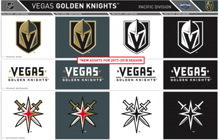
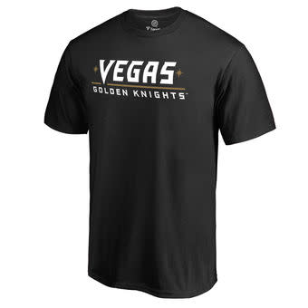
NHL.com already had posted Las Vegas merchandise on the league’s website.
Here is a t-shirt with the official logo:

And another t-shirt that gives a different look:
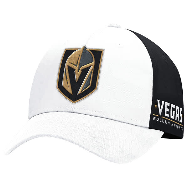
Here is a white and black hat with the logo:
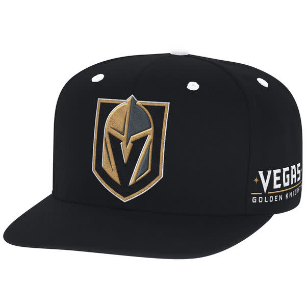
And check out how the logo looks on another hat in a different color:
So what to you think?
PASS OR FAIL: Vegas Golden Knights primary and secondary logos.
– – – – – – –
Josh Cooper is an editor for Puck Daddy on Yahoo Sports. Have a tip? Email him at puckdaddyblog@yahoo.com or follow him on Twitter! Follow @joshuacooper
MORE FROM YAHOO SPORTS

 Yahoo Sports


