
 Yahoo Sports
The Oklahoma City Thunder unveil alternate uniforms, to mild local acclaim

Alternate uniforms are usually a tough sell. In an attempt to stand out amongst 29 other NBA teams (most of which feature alternate uniforms), designers either make an attempt to go busy and strange with their creations, or simplify the design to the point of, well, what's the point?
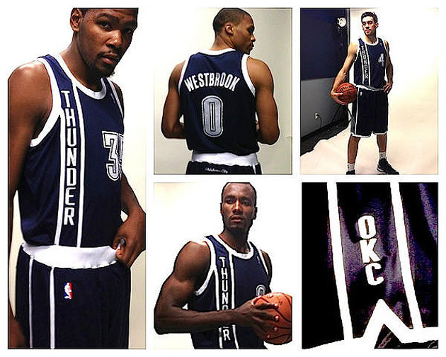
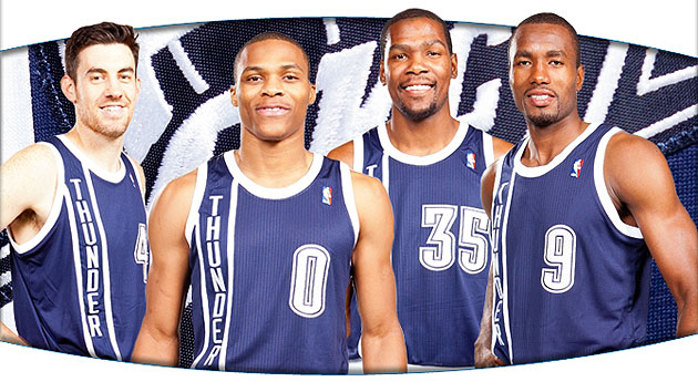
The Oklahoma City Thunder's new alternates, officially released on Thursday, fall into the latter category. That doesn't mean the duds are no good, though. Rather, we think they're kind of cool; especially considering that the designers were working off of a relatively staid logo and pattern with the typical Thunder uniforms. Sure, they're a money-grab; but it's still a pretty fetching design:
(Of course, a fashion-challenged blogger who wears nothing but ancient blazers and jeans and says things like "pretty fetching design" without a hint of irony probably isn't the type of person the Thunder are trying to win over, but that's not our problem even if it kind of is.)
From the team's website, here's the breakdown of the thought that went into the secondary styling:
As the Oklahoma City Thunder begins its fifth season, it is an opportune time to enhance our brand profile through the expansion of our uniform portfolio.
The new uniform illustrates many characteristics inherent in our identity:
• The two-color scheme is simplistic yet bold in the dominant use of navy blue and white.
• The unique vertical presentation of the word 'T-H-U-N-D-E-R' demonstrates strength and illustrates the rising nature of our team and community.
• The font used for numbers and letters are consistent with our current uniform while the script 'Oklahoma City' on the shorts provides a classic, yet modern, application.
• The vertical 'O-K-C' on the shorts embraces the organic and loyal support of our fans who chant those letters throughout home games.
Overall, the minimalist design and clean lines are timeless and reflect the personality of our industrious, hard-working, proud and committed community.
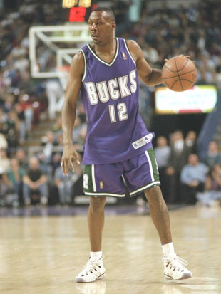
The one bullet point the team's website forgot to include is, "Looks a ton like the Milwaukee Bucks jerseys from the mid-1990s."
Local reaction, at least four deep in this feature from Tulsa World, hasn't really been kind to the new look, though. From Bill Haisten at TW:
From Taleya Mayberry, a University of Tulsa senior basketball player: "My first thought was, 'Huh?' I didn't even recognize who it was at first. It's just weird. It looks like an international jersey or something. Like a European jersey. I like the back of the jersey, and I like the all-white waistband. The Thunder down the side — I don't know about that."
From Marti Levinson, a Tulsa dentist and Thunder season-ticket holder: "I get the whole retro thing, but navy? That's not even their color. If they were going for a retro look, they definitely succeeded. The vertical Thunder on the front is kind of weird. The whole thing just catches me off guard because it's so different. I don't hate it — it might grow on me eventually — but my first reaction was 'yuck.' "
That's just two of four people that Bill interviewed, and though their initial opinions are pretty dour, the proof is in the selling.
And, as the New York Times relayed in must-read detail recently, the Thunder are an easy sell in OKC. In spite of the money woes that could see the team moving ahead without a James Harden or even Kevin Martin to show for things this July.
It's a good look. Now, let's get Kevin Durant's scoring average back up to its usual marks, and we'll be fine.
