
 Yahoo Sports
 How fast is COVID-19 spreading in your county? This online tool can tell you
A team of researchers developed a new interactive map that can predict how fast a coronavirus outbreak is spreading in a U.S. county by estimating the number of days it will take for its caseload to double.
The tool was created to help transition COVID-19 mitigation efforts from a state-level approach to a more local one, which the experts say can help government officials implement more specific measures, like closing restaurants in just one county, to prevent viral spread in neighboring areas.
Last week, the “COVID-19 Outbreak Tool” “verified” an outbreak in Iowa’s Johnson County, which was tied to cases at the University of Iowa, researchers with Massachusetts General Hospital, Harvard Medical School, Georgia Tech and Boston Medical Center said Tuesday in a news release.
“For effectively controlling the pandemic, it is critical to detect an outbreak in a timely manner so that the affected area can be isolated and the spread of COVID-19 infections to neighboring areas can be minimized; however, due to several reasons, it may take days or even weeks for humans to manually detect an outbreak,” Dr. Turgay Ayer, the director of Business Intelligence and Healthcare Analytics at Georgia Tech’s Center for Health and Humanitarian Systems said in the release.
“Our data-driven machine learning–based solution significantly speeds up and automates that process,” Ayer added.
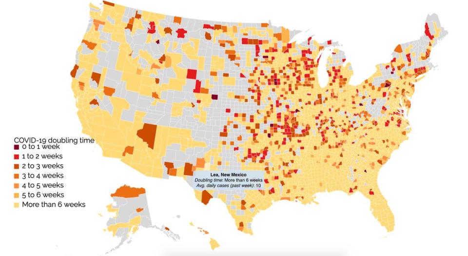
The map analyzes COVID-19 cases and deaths, face mask mandates, social distancing policies, the number of tests administered and the rate of positive test results in each county to predict outbreaks days before they happen. As of Sept. 16, the map shows that some counties in Midwestern states are predicted to experience outbreaks in one to three weeks.
The machine-learning tool, updated two to three times per week, also uses data from the Centers for Disease Control and Prevention’s Social Vulnerability Index — a feature that determines the “health-related resilience” of communities when exposed to “external stresses,” such as disease outbreaks.
By navigating the map you can find population data, total new coronavirus cases in the past week, average daily cases in the past week and the doubling rate. Red colored boxes indicate counties that are predicted to see double their current cases in one to two weeks, while yellow boxes belong to those that won’t see doubling for more than six weeks, according to current data.
Counties colored in gray “have less than 20 new cases in the past 22 days and so considered to have insufficient data,” the website reads.
