
 Yahoo Sports
A comprehensive ranking of every Toronto Raptors jersey, ever

Civilizations come and go, but a bad jersey can ruin an NBA team forever.
Given the relatively young age of the team, you might think the Toronto Raptors don’t have all that many jerseys. But oh, you sweet naive fool, you’d be wrong — the Raptors have had so many jerseys. And save for one from 1946, most of them can still be found in the wild.
Looking back at all of them is more of a safari than an archeological dig, but still, each triple XL version tells a story. Whether it was a team on the brink, in crisis, one that would be rendered invisible if it got stuck in a computer, or a team finally comfortable with itself, they’re all here and meticulously ranked to the exacting standards of the heart.
The Ugly
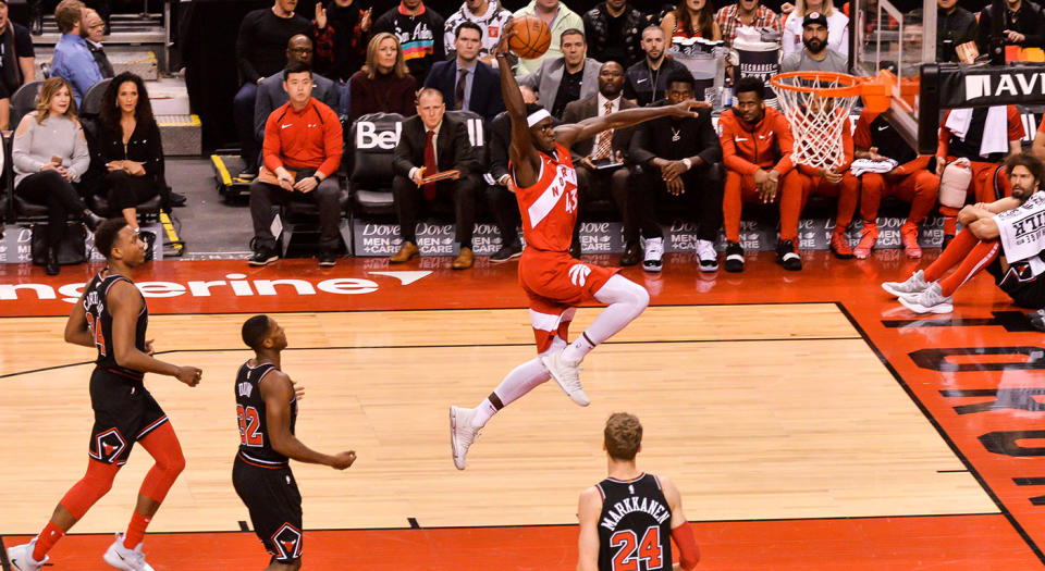
Canadian Forces Night (2012)
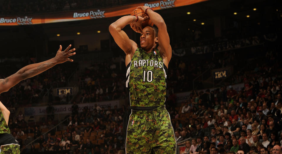
These ones were bad. Really bad. So bad that the first thing that comes up when you search for them is an Andrea Bargnani version, like the ghost of Raptors jerseys past staring you square in the face. Armed forces appreciation night I get, even if I don’t agree with it in terms of the separation of the military industrial complex and sport, but what I do not get is why the go-to camouflage for Toronto (the only Canadian outpost of the league) was digital.
First, digital camo is like The Jetsons version of the future of clothes if Stitches outlets were given total control. Second, if you’re going to go deep into the year 2012 why not make it ice camouflage? The only gift this jersey ever gave us is all the photos of baby DeMar DeRozan, Kyle Lowry, Terrence Ross, and Jonas Valanciunas from that era.
St. Patrick’s Day (2008-2012)

This is almost exactly tied with the pile of pixelated puke the military jerseys resemble, but this iteration gets a slight advantage in being one solid colour. A lot of other teams went in on this but even the clashing of Knicks orange with St. Paddy’s green was somehow not as gross as the Raptors ubiquitous silver chevrons or the mental image of several thousand drunk college bros burping in unison while proudly wearing this jersey.
This version also ekes out slightly ahead of the digital disaster preceding it in the list because the Raptor himself magically turned completely green for the games in which these were worn, meaning there is an alternate, Hulk green Raptor suit still kicking around somewhere.
NBA Europe Live Italian and Spanish (2007)

Rather than ruffle any ethnicities by declaring one of these worse than the other, I can confidently say they were both very bad. The Raptors’ Italian jerseys looked almost identical to the home white jerseys of the same era, but the armpit chevrons had a green one thrown into the mix to very lazily mimic the Italian flag. The Spanish jerseys were a little too spicy for their time, an all-red affair save for white lettering with goldenrod chevrons slapped up top and stripes down either side of the matching shorts. Both versions really shouted, “Oh shoot, can wearing a flag as clothing count as cultural representation?”
Home White (2006-2015)

To All The White Jerseys The Raptors Have Worn Before: None were as boring as these. They sort of look like the free racing bib you’d get for entering a fun run, and when the very intense 20-year anniversary insignia on the top right-hand corner showed up it became a little too WWE Raw for me. The jersey had a little red maple leaf at the middle-top of the back and on the shorts, right at the navel, which in terms of flare sort of has the opposite effect and seemed like some sneaky Air Canada branding. Remember how inconsistent Lou Williams was in these? But how tall Amir Johnson was in them and that thing he did with his hair once to match the maple leaf?
The Bad
Away Red (2006-2015)
Speaking of racing bibs, these jerseys were still that but at least from a race with some prestige, like one where you had to pay a little to enter and got some nice catering at the end. These jerseys were great at making Chris Bosh’s neck look powerfully long and the Matt Bonner era had some weird, oversized fits. Overall this version made everyone look like they weren’t eating enough and I don’t like that.
Home White (1999-2006)

Pretty forgettable by today’s standards, this version of the Raptors home white came after they ditched the iconic sneaker-wearing dino and took one giant step back from the ’90s, which at the time everyone wanted to forget. While a snooze, this jersey was formulaic for every version that came after. So while I don’t necessarily like it and find it fairly wrought with the overall technological (Y2K), economic (recession), political (9-11 and the subsequent invasion of Iraq) and social (Scary Movie) confusion of the time, I do respect it.
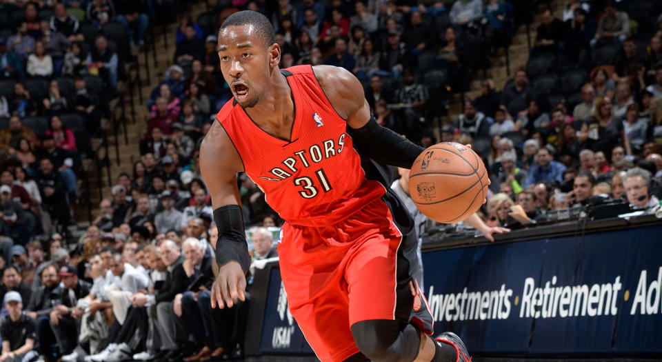
Away Black (2006-2015)
Amir Johnson started wearing a tight black t-shirt under this version which made him look even taller, and James Johnson unfortunately decided to dye his hair red to overcompensate for all the time he spent on the bench. Patrick Patterson wrote a great Players’ Tribune piece that talks about his time on the team going from this jersey to the current version, and basically how bad the team was while wearing this version of the jersey up until about 2013. Anyway, this was the least boring version of this jersey. Everyone looked very goth in them!
OVO City Edition (2018-present)

The chevron finally went too far. For years it had been lurking where it should, just under the armpit of every guy on the Raptors roster, then an ad agency decided to pop it front and centre and make it 100x bigger in the hopes of making a Hypebeast of all of us. Well you know what? Fool me once with a purple throwback that’s slightly different than the inaugural Raptors jersey, shame on me, but fool me twice with a huge-ass, six-pointed chevron that is supposed to symbolize every borough in the city and the northern axis on which the city sits in comparison to the rest of the league? You need to be stopped, 22-year-old creative director.
Purple Throwbacks (2015)
These are sort of like getting a no-name cola when you really have a craving for Coke. It’s more or less the same but there are certain key elements missing, for which you cannot put your finger on. It just won’t satisfy.
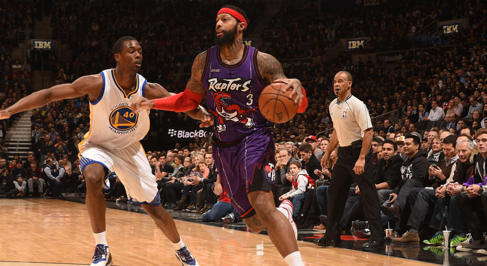
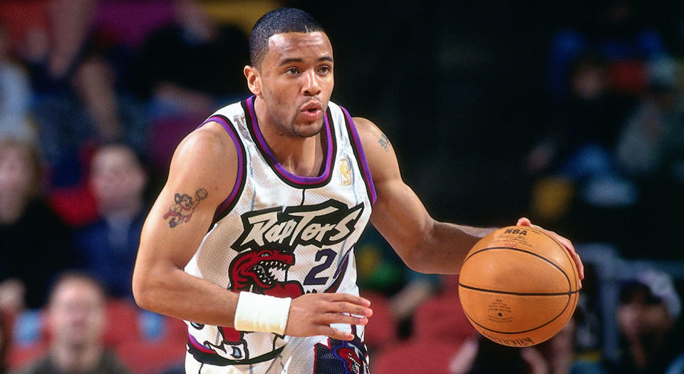
Away Purple (1999-2006)
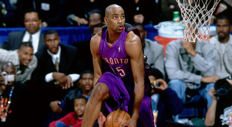
These jerseys are a bit of a juxtaposition because they were worn during a period of high drama—Vince Carter incinerating the 2000 NBA Dunk Contest and Carter vs. Iverson in the playoffs—but are simultaneously the most luxurious and languid jerseys the Toronto Raptors have ever worn. The fabric and colour and fit of that time made them look like big, billowing silk pajamas. Purple is the colour of royalty and Prince, the man, and as good as those 2018-2019 Prince Timberwolves City jerseys look this is proof that the Raptors did it first. They were so purple. They didn’t even have any additional flair on these, just uninterrupted vistas of the richest, iridescent purple fabric that conquerors of yore would have filled the cargo holds of their frigates with to bring home and buy a castle with.
OVO Black and Gold (2015-present)

Retrospectively we should have seen that introducing a gold colourway could only bring about the Frankenstein’s monster of the gigantic gold chevron as our new common identity, but it was an exciting time full of possibilities and we didn’t know better.
Alternate Black/Red (2015-present)
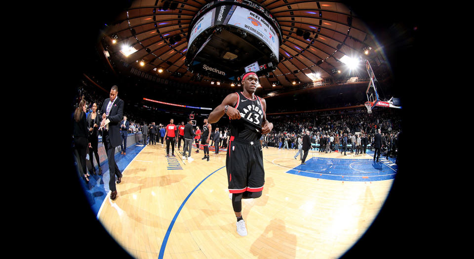
Fine and good. But for once wouldn’t it be funny to wear a road alternate the same night the opposing team was wearing their home version of the exact same colour, rather than doing opposite complementing colours? Maybe on April Fools? Either way, some great confusion could ensue. Amir Johnson would have looked great in these.
The Good
OVO Swingman City Edition (2018-present)
The reason this jersey is ranked higher than its earlier counterpart is that to me, it says, “We’re finally confident enough to make some bad decisions.” That and the gold here is more of a mustard, which is an underrated colour in the NBA. But still, the City Editions are a chance for teams to push it and put out some stunners or bummers, but not really attempting either is a drag!
Chinese New Year (2017)
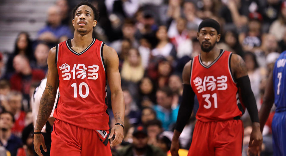
For the gold rush era of Raptors jersey design that came only a year before these special editions were released, couldn’t a little of that precious metal be spared to give some embellishment to this jersey? Like the whole thing was a hóngbāo filled with promise and prosperity? Missed opportunity.
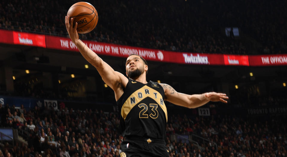
Home White (2015-present)

These jerseys are supportive. They get out of the way of every player and give them a backdrop in which to be themselves. Like a nice frame on a work of art or your oldest, smartest friend who calls you on your shit but ultimately does it because they know you are the only thing getting in your way.
Toronto Huskies Blue (2016)

Ah sweet Valhalla, where the basketball jerseys always have a classic, round neck instead of an aggressive V or a contemporary take on a V that ends up looking like an unintentional bolo tie for a neckline. This jersey was a step in the direction of the classics (the Bulls, the Knicks, the Celtics, all with their timeless jerseys in shape and overall intent). Circle neck jerseys just look like jerseys on-purpose, not some weird performance gear moonlighting as a jersey with a faux aerodynamic design that are only going to drag you down and also chafe. Finally Toronto did a simple thing that looked good with its gear and it lasted … three or four games. Plus the blue was nice.
Toronto Huskies White (1946/2009)

Hear me out! Is there anything more classic than the original name on the original jersey shape, fabric so thin it can’t be regulation, the logo of an overweight, out of breath husky and cartoony-metal font of which your dad may as well have doodled on a receipt from getting his winter tires put on? These gotta come all the way back.
Earned Edition (2018-present)
This predominantly extremely red jersey was released in tandem with the Christmas jerseys of the teams who would play Christmas Day games, I guess as a consolation prize that the Raptors would not. It’s really red. Almost a fluorescent red. The tint of it looks a little bit different on every Raptor so I would also venture to say it is a living red. The design of it is pretty simple—somebody went wild using the paint bucket tool on the 2018-2019 City Edition—but the result is closer to a superhero costume. And frankly? It seems to be having a psychological effect on opposing teams.
There is also something that happens with the bright white chevrons on the shorts in contrast with the red that makes every guy’s legs look 11-feet long. It’s incredible. Who will be brave enough to swap the siren red of this jersey with William Lyon Mackenzie King’s tired-ass red on the Canadian flag at the Canadian flag factory going forward?
Inaugural Away Purple (1995-1999)

Nineteen-ninety-five was a wild year for NBA jerseys. The Detroit demon horse head with flames for a mane and exhaust pipes for letters; the giant, spiritual Bucks buck materializing on a purple and green field; the Arizona NBA All-Star jerseys; the giant Hawks hawk grabbing a basketball where the belly button goes; the goofy zoot suit Rockets, and God forgive us, the Vancouver Grizzlies’ whole entire thing. And while I have a soft spot for a high percentage of those bad looks, the best of the bad, the loudest of them all, was the Raptors road game purple. It was a deep purple. If the English rock band of the same name didn’t already have that name, technically, as of 1968, I’d wonder if this wasn’t the colour that inspired it. It’s iconic.
Inaugural Home White (1995-1999)
Everything I said about the inaugural purple but dialled down juuust enough that you could wear it to a formal event: the birth of a child, the swearing in of a fairly elected, truly progressive leader, out to dinner, to a funeral, to work on a Monday, to a wine tasting, on a first date, on a blind date, on a date with yourself to the spa, in the spa, to a house of worship—whatever denomination you want, to the symphony, on a gondola ride in Venice or at your own wedding—this Raptors jersey is the most versatile of them all.
I’m not saying let’s stop trying to reinvent the wheel here but when the wheel is a clean, white jersey with a gigantic red dinosaur expertly holding a basketball, turning to give at once a sassy and threatening glance, while wearing sneakers its razor-sharp retractable claws are popping out of with jagged, ’90s lettering and a capitalized R, T and S for no other reason other than it looks good, and the matching shorts have a little, sneaky, different raptor eating the initials of the team… well, what are you going to do with that perfect wheel? Drive it off into the sunset and never look back.
More NBA coverage from Yahoo Sports
