
 Yahoo Sports
With Chief Wahoo getting exiled, this should be the new Cleveland Indians logo
Chief Wahoo’s days are numbered. The long-time Cleveland Indians logo has been deemed “no longer appropriate” by Major League Baseball, a stance the Indians agreed with after a couple years of discussion. As MLB announced Monday, Wahoo will go away before the 2019 season.
Thus far, the Indians haven’t said they’re necessarily looking for a new logo. A few years ago, they made the Block C their primary logo over Chief Wahoo, so they’re not suddenly without proper identification. However, if the Indians wanted to look around for something new, they wouldn’t be without ideas.
There’s an alternative I like best. But before we get to that, let’s look at the Indians’ current look and a past look that could also be cool to bring back.
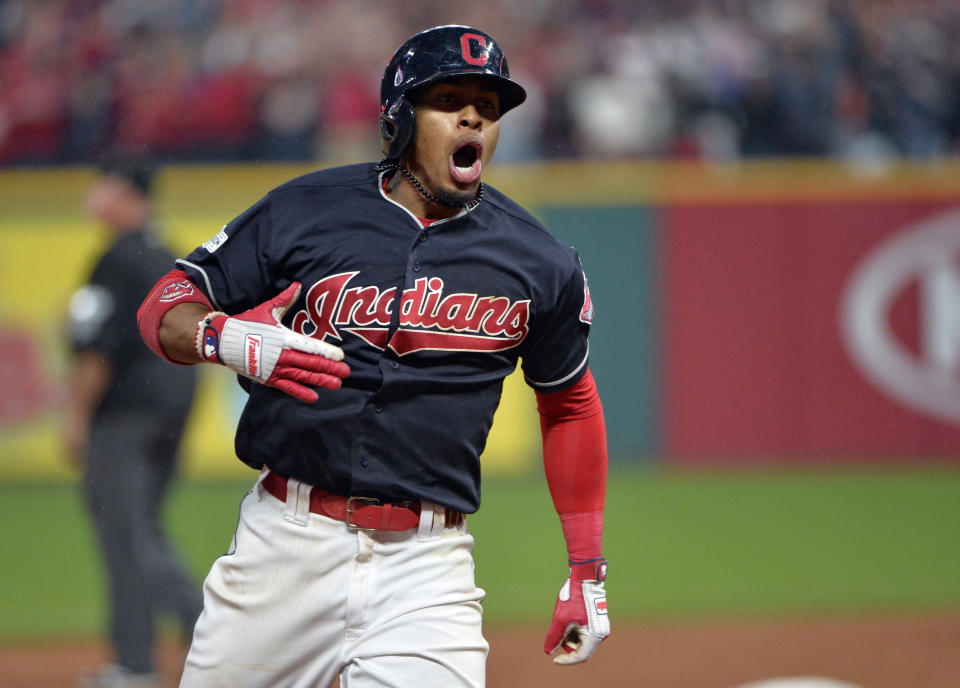
WHAT THEY HAVE NOW: THE BLOCK C
The Indians made the Block C their primary logo in 2014, but you’ve still seen plenty of Chief Wahoo on the field since then. In fact, during the 2017 postseason, the Indians wore Chief Wahoo caps pretty much every game. That’s not the strongest endorsement for the Block C.

WHAT THEY HAD BEFORE: THE MID ’70s
The Indians have worn these 1970s throwbacks a couple times recently. They’re from 1974-1977 and are one of the team’s better looks from the past. The caps are especially worth looking at, as that C might please people who think the Block C is boring. The jersey font is also unique and eye-catching.
With the Chief Wahoo news it's awesome to hear the amount of people wanting to see our C Feather design as the new logo. We understand both sides but if the Chief is going away for good we still need to acknowledge our teams heritage with more than the block C. RT if you agree! pic.twitter.com/PIoP4LyNzL
— GV Art + Apparel (@GVartwork) January 29, 2018
WHAT THEY COULD HAVE: THE CROOKED C & FEATHER
This look is my favorite and where I think the Indians might want to consider going in the future. This C isn’t exactly the same as the mid-70s one the Indians wore, but it’s close enough that it feels like a tribute. And it’s better than the Block C.
The feather feels like a good way to acknowledge the Wahoo heritage without going full red-face caricature. We should note, this isn’t actually an MLB logo. It’s made by GV Artwork, a designer in the Cleveland area, but it’s been getting a good amount of social-media support since the Wahoo news broke.

– – – – – –
Mike Oz is the editor of Big League Stew on Yahoo Sports. Have a tip? Email him at mikeozstew@yahoo.com or follow him on Twitter! Follow @MikeOz
More from Yahoo Sports:
• Caught: Culprit who yelled during Tiger’s backswing
• Super Bowl or not, Eagles won’t have a QB controversy
• Hawks fan hilariously owned by And1 legend
• As Indians dump Wahoo, this should be new logo
• Eric Adelson: Korea tensions have serious meaning for one Patriot
