
 Yahoo Sports
 Auburn says it does not have a new logo after altering its logo
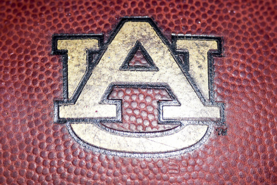
Your eyes do not deceive you: Auburn made changes to its logo this week.
Auburn changes their logo. @bmarcello first to report about the new look. pic.twitter.com/5kdGSN3ylw
— Pat Smith (@patsmithradio) August 9, 2019
It is small but noticeable — the white space between the “A” and “U” has disappeared. Fans are mad, with more than 2,300 people signing a petition to stop Auburn from changing its logo.
The university, in an attempt to tone down controversy, claimed that it does not have a new logo but rather a “new visual identity system.”
Auburn University reached out to tell me it's "inaccurate" to report they have a "new logo." This is the communications team's explanation for what they say is not a new logo. pic.twitter.com/eSMi4d6vHQ
— Brandon Marcello (@bmarcello) August 9, 2019
Uh huh.
Mike Clardy, Auburn’s assistant vice president for communications, told 247Sports that the change will “make it compatible with the many ways, especially digital, in which it is now used and to help us further elevate the Auburn brand.”
Former Auburn QB and coach Dameyune Craig joins many fans in questioning the change of the AU logo, per his comment on the Auburn Uniform Database Instagram page. pic.twitter.com/8UOoEJjGoA
— Clint Richardson (@Clintau24) August 9, 2019
It just dawned on me how incredibly ironic it is that Auburn is changing their logo right as the team kicks off the season where their slogan is…"Ride for the brand".
— Cʜɪᴢᴀᴅ ⚜️ (@AUChizad) August 9, 2019
The original logo has been in place on Auburn’s football helmets since 1966. It appears that a change, even one ever so small, has irked the fanbase.
In a separate move, Auburn is reportedly also switching its font from Copperplate to Sabon. Yes, “Sabon,” one letter off from the last name of a certain rival head coach.
For all the talk about elevating the Auburn brand, the past 24 hours or so haven’t exactly been great in terms of the font and logo game.
More from Yahoo Sports:
