
 Yahoo Sports
Braves ditch insensitive patch on new throwbacks
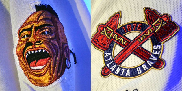
It was a complete no-brainer, but props to the Atlanta Braves for placing a new crossed tomahawk logo on the sleeve of their new weekend alternates. The cream-colored throwbacks — which the baseball world learned about a few weeks ago — are based on the uniforms that the team first wore after moving to Atlanta in the 1960s.
[ Related: Braves take big risk by snoozing through winter ]
The jerseys of those less-enlightened times featured a savage on the sleeve and it's a wonder that anyone ever thought the image was OK. The logo strips Native Americans of any humanity and turns them into a one-dimensional character devoid of any sympathy or tribute. It honestly might be the only defense that the few defenders of Cleveland's Chief Wahoo have left. ("Well, it's not as bad as what Atlanta used to have.")
Thankfully the current Braves brass made the necessary alterations before the retro resurrection so that paying tribute to the franchise's history is possible without alienating a group of people in the process.
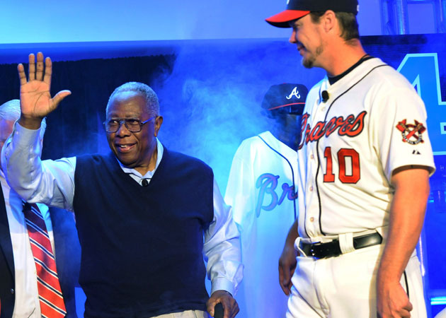
Even Hank Aaron approves.
Other popular content on the Yahoo! network:
• Tigers' Justin Verlander also excels at Super Bowl predictions
• UFC judging criteria questioned after Carlos Condit victory
• OMG: M.I.A.'s raised middle finger raises question: Why the provocation?
