
 Yahoo Sports
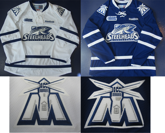
Mississauga Steelheads introduce new jerseys

The shift made by Mississauga's OHL team in their branding was seen, by myself anyway, as an effort by the franchise to reach out to fans closer to the region. The Mississauga St-Michael's Majors, named after the classic Toronto college team, never really fit in to the Mississauga region, which is a long subway ride, bus trip and walk out of the Toronto core.
So the change of the team's name from the Majors to the Steelheads reflected a change to bring the team closer to Mississauga's own culture. Junior hockey has really yet to take off the closer teams get themselves to Toronto. The IceDogs left a few years ago and the Majors struggled with low attendance through the first few years of their existence.
In choosing the new name and logo, new owner Elliott Kerr made sure to make this point:
"The new Steelhead logo is a great representation of Mississauga's heritage, the importance of the Credit River and one of its prized inhabitants, the Steelhead Trout, whose strength, determination and prowess will be brought to life by the skilled and dedicated players as they compete and help create a renewed energy and enthusiasm for the sport of hockey in our community."
The jerseys were released today, and as you can see by the images above, while the logo did its part to separate itself from Toronto hockey, the jerseys, released Friday morning, didn't do that.
"Staying true to the Toronto Maple Leafs Blue and White, the Steelheads will be wearing the traditional "Leafs look" from head to toe for the 2012-2013 season. In addition to the Steelheads team logo, the jerseys will feature a secondary logo which will be the shoulder patch on both the home and away jerseys. The "M" depicts the Port Credit light house with protruding beams of light, paying homage to one of the City's most recognizable landmarks."
While I guess the look will allow children to wear their Leafs jerseys to junior hockey games to look out of place, the colour doesn't do too much for me for a franchise looking to integrate itself into the community.
There's nothing explicitly wrong with promoting the culture of the region, but when the team struggles at the gate, you may be better off trying to create a distinct look. The Steelheads logo is underwhelming, but at least it associates itself with local wildlife, even if the colour scheme is bland and overused.
The "M" with the lighthouse is pretty cool, mind you, and that's the sort of thing that the Steelheads ought to focus on. Their own community's history and landmarks, separate from Toronto, viewed to be an alternative to the Leafs instead of just another offshoot of a popular Toronto hockey club.